4. The interface
This chapter is a “map” of the app itself — it shows where everything is on screen, how to move between sections, and how the app looks on a phone and tablet.
Overall screen layout (computer)
On a computer the screen is divided into three fixed areas:
- Side menu (the narrow bar on the left) — switching between the main sections,
- Top bar — the logo, the workspace switcher and your account,
- Main area — the content of the selected section (dashboard, map, list, etc.).
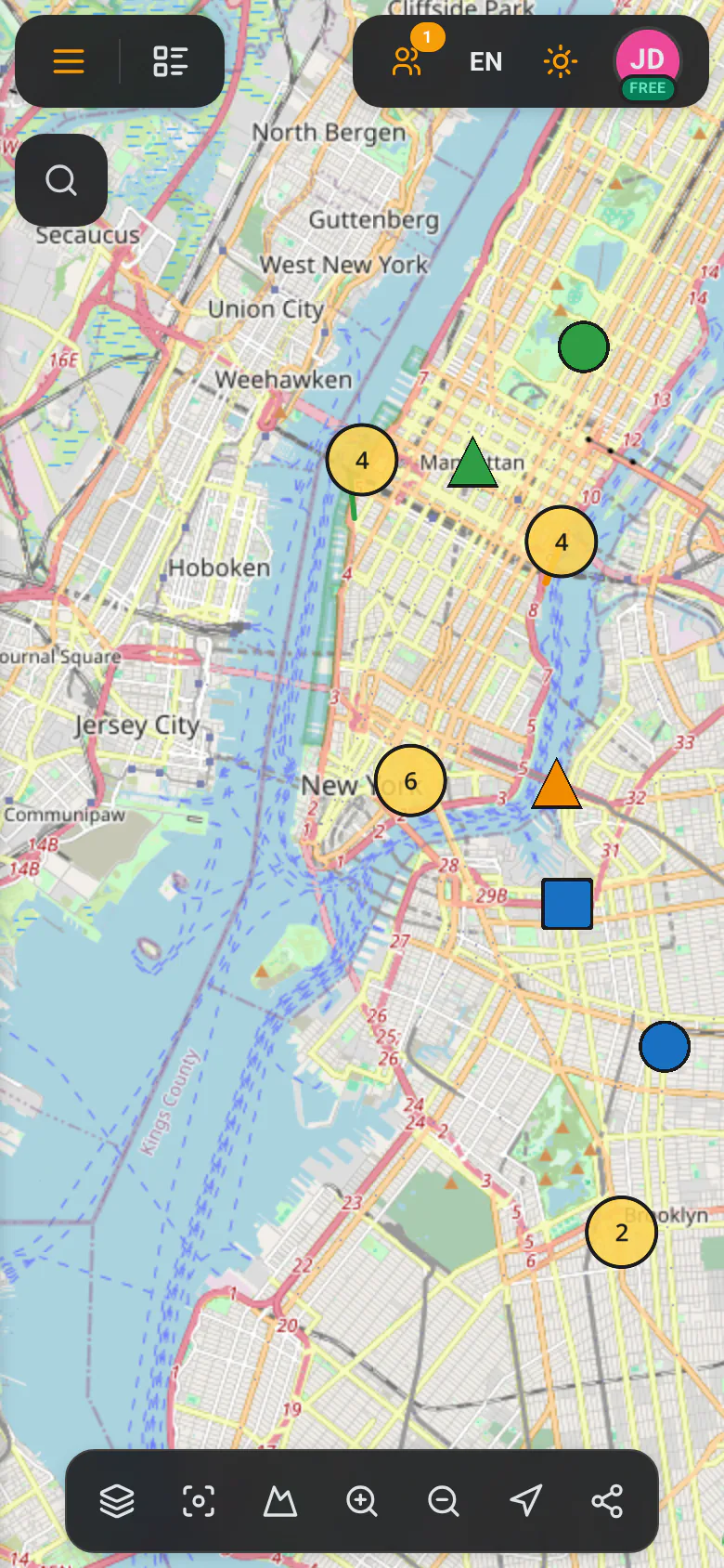
In map view the top bar disappears to make room for the map — its functions are taken over by a small floating bar in the top-right corner of the map.
Side menu (on the left)
The side menu is a narrow vertical bar at the left edge of the screen. Each item is an icon with a short label. The currently selected item is highlighted.
| Icon | Label | What it does |
|---|---|---|
| Grid | Dashboard | Opens the home page with the task summary and statistics. See Dashboard. |
| Map | Map | Opens the interactive map with tasks and notes. See Map & tools. |
| Gear | Settings | Opens account and workspace settings. It sits at the very bottom of the menu. |
In map view, an extra “Toggle side panel” button appears below “Settings” — it collapses or expands the list of tasks/notes shown next to the map.

Top bar
The top bar (visible outside the map) is divided into three parts:
On the left:
- the GeoMarkup logo,
- on a phone, also a menu (☰) button that opens the side menu.
In the centre — the workspace switcher:
- shows the coloured icon, name and description of the current workspace,
- clicking it expands the list of your workspaces, with a search field and a “New Workspace” button. See Workspaces.
When you’re viewing a list of tasks or notes, the centre of the bar shows an artifact switcher (Tasks ⇄ Notes) and a view switcher (Map / List / Kanban) instead of the workspace switcher.
On the right:
| Element | What it does |
|---|---|
| Team (people icon) | Opens the team-management panel. It may show how many people are currently online. See Team management. |
| Language | Switches the interface language (Polish / English). |
| Theme (sun/moon) | Switches between light and dark appearance. |
| Avatar | Opens the user menu. |

User menu
Clicking your avatar in the top-right corner opens a menu containing:
- your name and email address,
- the workspace switcher,
- “Settings” — go to account settings,
- “Logout” — sign out securely.
Working on a phone and tablet
GeoMarkup automatically adapts the layout to the screen size. You don’t have to set anything — just open the app in your browser on a phone or tablet.
What changes on a phone
- The side menu is hidden. You open it with the menu (☰) button — it slides out as an overlay, with full section names.
- Panels open full-screen. Task details or a form display as a full-screen window with a slice of the map visible at the top. You can:
- swipe the panel down with your finger to minimise it (revealing the map),
- swipe up to bring the panel back.
- Map tools arrange into a horizontal bar at the bottom of the screen. If they don’t all fit, swipe the bar sideways (a hint appears: “Swipe to see more tools”).
- In the top-left corner of the map, two buttons appear:
- menu (☰) — opens the side menu,
- list — opens/closes the list of tasks or notes.
- Instead of the right mouse button (which doesn’t exist on a touchscreen) you use a long press with your finger to open the context menu on the map.
Tablet
On a tablet the app behaves in between:
- in portrait — much like on a phone (hidden menu, full-screen panels),
- in landscape (when the screen is wide) — much like on a computer, but you control it by touch instead of a mouse.